Watercolor painting is a beautiful and delicate art form that has been around for centuries. One of the most popular subjects in watercolor art is animals. Painting animals in watercolor requires a delicate touch and a keen eye for detail, but with the right techniques and practice, anyone can create stunning animal paintings. In this article, we will provide a comprehensive guide on how to paint watercolor animals, including detailed examples.
- Getting Started: Materials and Techniques
- Choosing what animal to paint
- Get started Painting Animals in Watercolor
- Preparing Your Colors and Brushes
- Getting the Hang of Wet-on-Wet Blending
- Capturing Animal Skin, Fur, and Feathers with Texture Effects
- Working with Light and Dark Tones for Depth in Paintings
- Adding Details to Enhance Lifelike Quality
- Healing Mistakes Made During Painting Processes
Getting Started: Materials and Techniques
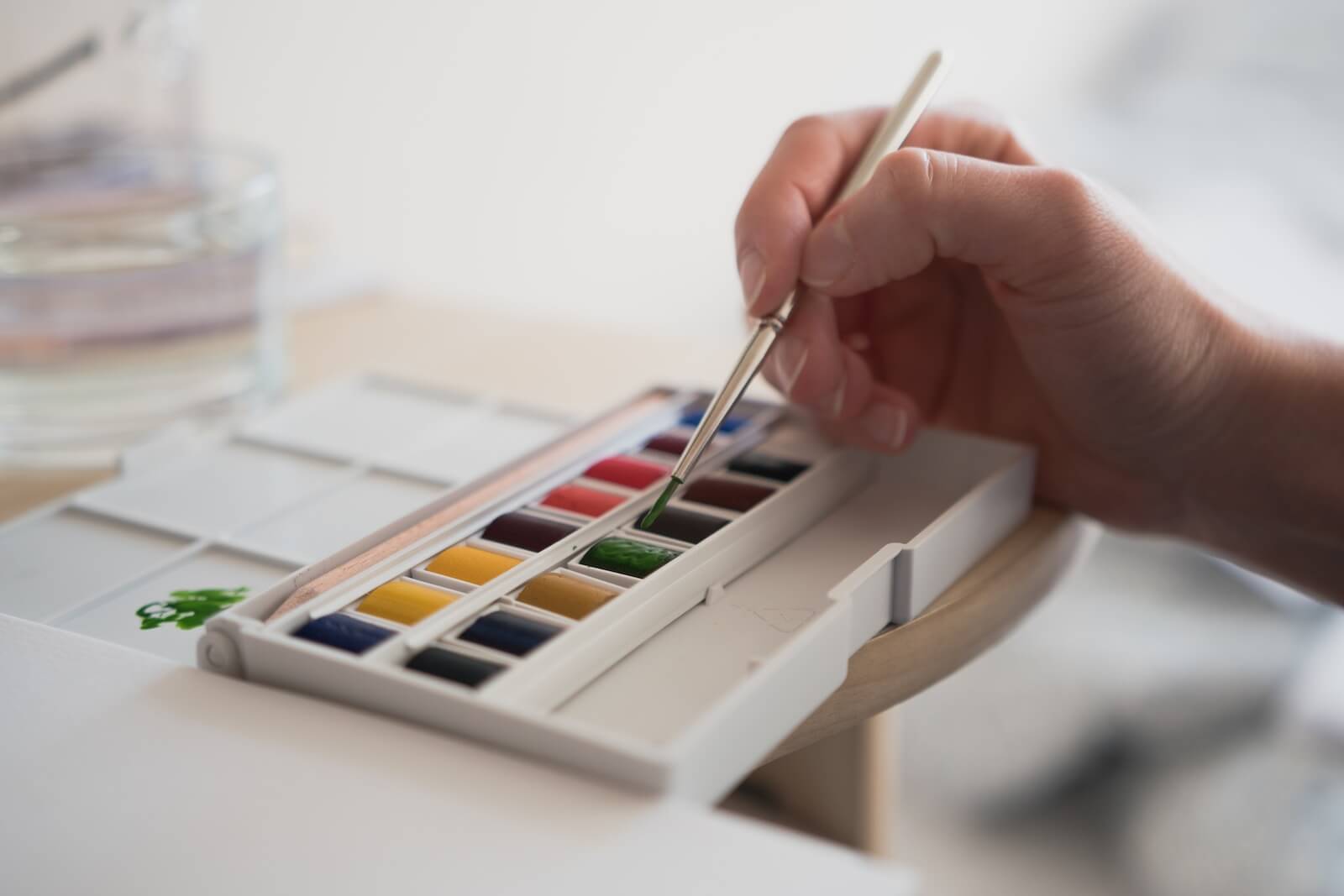
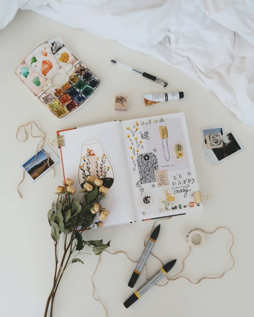
Before you can start painting watercolor animals, you need to make sure you have the right materials and techniques. Here is a list of the essential materials you will need:
- Watercolor paper: Choose a high-quality, acid-free paper that is specifically designed for watercolor painting.
- Watercolor paints: Invest in a set of high-quality watercolor paints that include a range of colors.
- Brushes: Use a variety of brushes in different sizes and shapes, including round brushes for detail work and flat brushes for larger areas.
- Water: Have plenty of clean water on hand to mix with your paints and clean your brushes.
- Palette: Use a palette to mix your paints and create custom colors.
Once you have your materials, it’s time to start practicing your watercolor techniques. Here are some tips for painting with watercolors:
- Wet-on-wet technique: This technique involves wetting the paper first and then applying wet paint onto the wet paper. This creates a soft and diffused effect.
- Dry brush technique: This technique involves using a dry brush with very little water to create a textured effect.
- Layering: Watercolors are transparent, which means you can create depth and dimension by layering different colors on top of each other.
Choosing what animal to paint
Tips for Painting Watercolor Animals Choosing the right subject for your watercolor animal painting is crucial. Here are some tips for selecting the perfect animal to paint:
- Look for interesting shapes and patterns: Animals with distinctive shapes and patterns, such as zebras or giraffes, can make for captivating watercolor paintings.
- Consider the lighting: Animals in different lighting conditions, such as during sunrise or sunset, can create interesting shadows and color contrasts.
- Focus on the eyes: The eyes of an animal are often the most expressive and captivating part of the painting, so make sure to capture them in detail.
Get started Painting Animals in Watercolor
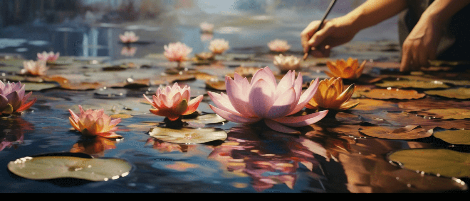
How to paint Water Lilies with Watercolor
Water lilies are a popular subject for artists, especially those who work with watercolors. These…
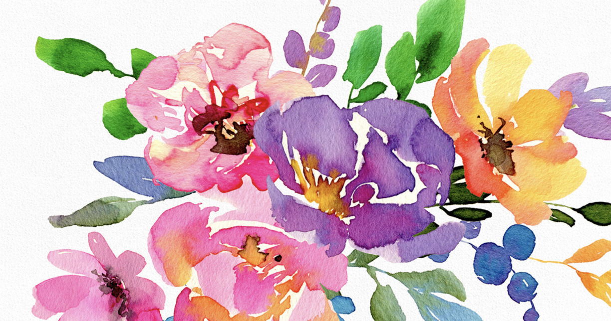
Watercolor Flowers – Ultimate Guide 2023
One of the most popular subjects for watercolor painting is flowers. Watercolor flowers are delicate,…
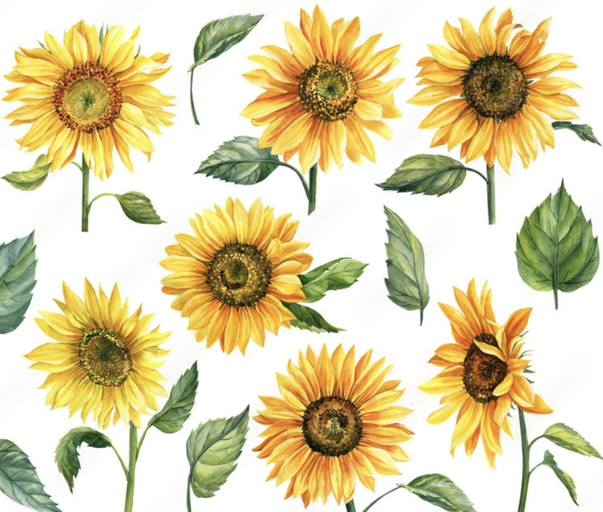
How to Paint a Sunflower with Watercolor – Complete Guide
Sunflowers are one of the most popular subjects for painting, and for good reason. Watercolor…
How to Flatten Watercolor Paper: A Step-by-Step Guide
As a watercolor artist we all know that paper is one of the most important…
How to Paint Realistic Hair with Watercolor
Watercolor painting is a beautiful and delicate art form that requires patience, skill, and attention…
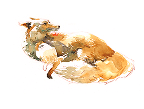
How to Paint a Fox with Watercolor – Ultimate Guide 2023
Whether you’re a beginner or an experienced artist, painting a Fox with watercolor can be…
Preparing Your Colors and Brushes
Choosing Colors: When you begin to paint, the first step is all about having the right colors. Start by selecting a few basic primary and secondary colors. You can purchase artist-grade paints which will last longer and provide more distinct, vibrant hues than student-grade materials. Once you have your desired palette of paints in hand, it’s time to pick up some brushes too.
Essential Brushes: Choosing quality brushes that are suited for watercolors is key if you want to create a successful piece of art – size matters! Brush sizes range from very small (000) for painting details or thin lines through large (12) for washes. Generally speaking, freshwater sable and synthetic blend brushes are the most suitable types for watercolor painting due to their ability to hold a good amount of pigment when wet but still offer enough control over each brush stroke they produce.
Finally, it’s important not just what supplies you choose but also how well they are cared for during use and afterwards too – properly looking after your tools will ensure they last through many paintings! In terms of maintenance whilst creating; make sure every color has its own mixing tray as this can help prevent them from becoming muddy mixtures or contaminated with other pigments throughout your work session. Additionally, clean any used brushes under lukewarm running water before storing flat on an absorbent surface such as paper towels – allowing them time dry before being stored away upright in containers like jars with plenty of room inside so that hairs don’t become damaged or bent out of shape!
Getting the Hang of Wet-on-Wet Blending
When it comes to watercolor painting, wet-on-wet blending is an essential skill. This technique involves applying two colors of paint onto a damp paper, allowing them to mix and blend together. It can be used for creating subtle shading effects or for adding interesting textures and details to your work. With some practice, you’ll soon have the hang of this unique blending method.
To begin with, start by preparing your supplies – you’ll need two colors of watercolors (a light color and a dark color), as well as several sheets of heavy watercolor paper that has been lightly dampened. Then make sure that the colors you choose contrast sharply with one another – for instance, use a bright blue next to a deep red or yellow.
Step 1:
Start by taking your lighter colored paint and apply it in broad strokes across the page in any design that you like. Try not to overwork this layer too much though – aim for just one even coat.
Step 2:
Once your first layer is dry (it should take around 30 minutes depending on how thickly applied) then add a few drops of darker color into areas where shadowing would occur naturally – such as beneath ridges or edges – using either brushes or palette knives.
Step 3:
Finally, watch closely as both colors combine together! The wet-on-wet technique works best when done quickly; after about 15 seconds the darker color will start merging with the lighter shade so adjust accordingly if needed.
Capturing Animal Skin, Fur, and Feathers with Texture Effects
Texture Effects on Animal Skin, Fur, and Feathers
Texture effects are an incredible tool for giving photographs of animals a unique look. By using just a few clicks in your favorite image editing software it is possible to create amazing textures on the animal’s skin, fur and feathers. This can help bring out their personality by enhancing the details in the photo or give them a distinct style altogether.
For example, if you have taken a portrait of a cat then you could use texture effects to make its fur appear more plush and fluffy. A simple adjustment like this can instantly add life to the photograph and draw attention to all those little details that otherwise might have been overlooked. If you have taken photos of birds then you might be able to enhance certain areas such as wings or tails with subtle texturing which will further emphasize their beautiful colors and patterns.
Using texture effects on wild animals is also great for creating atmospheres full of drama which would be difficult without it since they can’t be posed at will like domestic pets would. By carefully adjusting parameters such as contrast or brightness around specific regions in regards to overall composition one can really manipulate how viewers perceive these creatures while still keeping true to reality thanks to digital photography technology today.
These techniques don’t only apply when taking pictures of living creatures either! The same principles hold true when photographing taxidermy specimens too; though instead of adding realism they provide an opportunity for even greater creative expression due mainly because there are no risks involved in making mistakes with adjustments since these subjects don’t move around so much! Utilizing various subtle changes between layers combined with color shifts for different parts will allow photographers all types endless opportunities for achieving truly awe-inspiring results that wouldn’t ever be possible shooting outdoor wildlife alone – especially considering most species need very specialized equipment (think long lenses) just capture them accurately enough let alone applying modern post-processing techniques afterwards!
Working with Light and Dark Tones for Depth in Paintings
Bringing Balance with Light and Dark Tones
Light and dark tones work together to create balance in paintings. A painting is a two-dimensional representation of three-dimensional space, using light and dark tones to convey depth and perspective. The use of light or white tones on the surface of a painting can suggest the presence of reflected light from other elements, while darker shades indicate shadows cast by objects within the composition. By manipulating different levels of brightness through various values (degrees) of color, an artist will be able to create realistic representations that appear as if they are actually existing in physical space.
The Visual Weight Of Colors
Colors also have visual weight associated with them. Lighter hues tend to take up less visual space than darker ones; reds, oranges, yellows usually stand out more against lighter backgrounds than blues or greens do because those colors have more contrast between each other whereas similar hues such as blue/green blend into one another easily when placed side-by-side on a canvas creating a harmonious effect. To add drama or interest to your artwork you may want consider emphasizing certain areas by using strong contrasting colors like black alongside bright whites which will draw attention away from other parts that might otherwise distract viewers’ attention away from your focal point(s).
Using Color Combinations for Depth and Interest
Interesting combinations of both light and dark tones can help create depth in paintings – for instance warm oranges contrasted against cool blues with highlights or accents brought out through brighter yellows or purples all working together to bring life into any piece! Additionally, it is important not forget about midtone values which lie somewhere between full saturation at either end – these offer perfectly balanced transitions across large portions without overwhelming detail elsewhere while still providing enough tonal variation so that everything looks cohesive overall!
Adding Details to Enhance Lifelike Quality
It’s easy to overlook details when creating art, especially when working with digital tools. Adding small but important touches can add a lifelike quality that elevates your work and lifts it to the level of excellence. That’s why it is essential to pay attention not only to the big picture elements of a painting or sculpture, but also all those tiny details that make up the whole.
Color
Color plays an enormous role in creating lifelike effects in your digital artwork. Paying attention to subtle variations in color within a single object or between two objects can help create convincing 3D effects and draw viewers into your work more deeply. For example, if you are depicting grass, think about adding multiple shades of green instead of just one flat color across the entire area. If you are concerned about accuracy, you may want to use a reference photo for guidance so that you capture realistic lighting conditions and hues.
Shadows
- Shadows, like reflections from surface textures such as fabric or glass, add dimensionality and depth by suggesting the presence of unseen light sources.
- Highlighting, which gives textured surfaces such as wood grain their distinctive appearance and adds emphasis on certain areas.
These two techniques combined will bring out impressive detail even at minimal levels since shadows have the potential for adding realism without exhausting resources like rendering time or file size.
3 . Textures
Realistic rendering requires consideration for texture—something often overlooked by novice artists due to its complex nature.
There are many different types available including metal/stone materials like marble as well as organic compositions like fur – each requiring its own set of brush strokes whereas others simply require black & white fillings.
When using textures correctly they can really bring life into any scene whether static or dynamic depending on how much variation is applied throughout various objects highlighted with light source(s).
Healing Mistakes Made During Painting Processes
Painting is an art form that can be enjoyed by beginners and experienced painters alike. When mistakes are made during the painting process, it can often feel discouraging and overwhelming. However, understanding how to heal these mistakes will bring confidence back and help you become a more seasoned painter.
Lastly, it’s important to remember that no matter how many mistakes you make along the way during your journey into becoming a better painter – there is always room for improvement! As such don’t beat yourself over any errors but simply view them as learning opportunities – chances where further growth may occur even if at times it doesn’t seem like it right away!